Note! The total time spent on each contribution is an approximation.
At a very early stage of the project I made two visualization prototypes. The purpose of these prototypes were to explore different ways of visualizing the data. Even though these prototypes were not used in the final visualization, they contributed to our understanding of how the data was structured and how the data should be visualized.
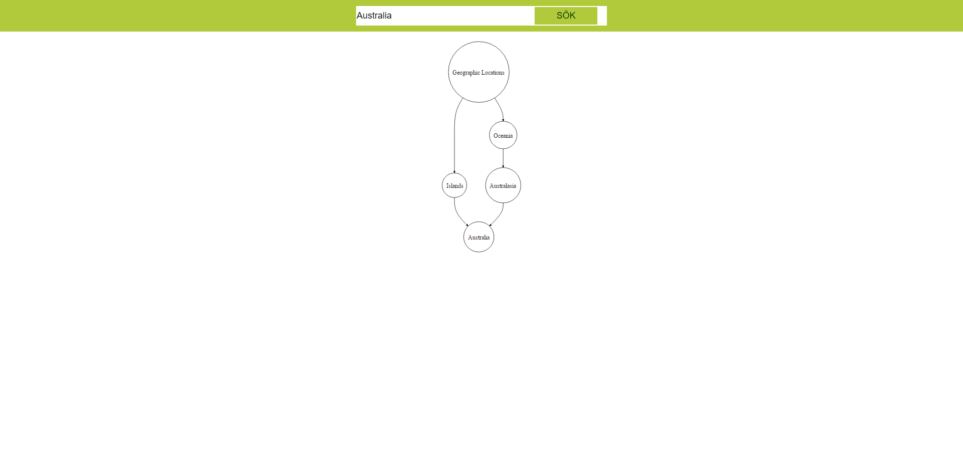
The first prototype used d3 and dagre-d3. This prototype visualized the data by merging certain nodes that were duplicated
(nodes which were present at more than one location in the trees). It also had zoom and pan functionality implemented.
A screenshot of the prototype is available at ivismesh.github.io/individual/jonatan/dagre/prototype_dagre_screen.jpg
The working prototype is available at https://ivismesh.github.io/individual/jonatan/dagre/
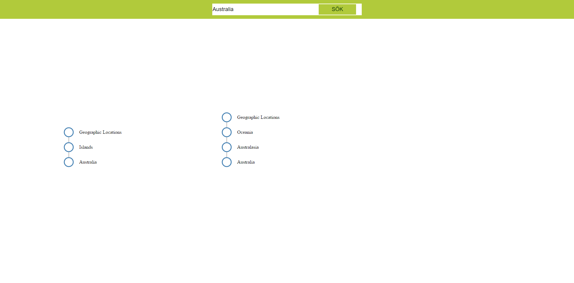
The second prototype used only d3 and visualized the data as separate lists, showing the search term as well as
all broader terms. A screenshot of this prototype is available at ivismesh.github.io/individual/jonatan/lists/prototype_lists_screen.jpg
The working prototype is available at ivismesh.github.io/individual/jonatan/lists/
Total time spent: 16 hours.
After we had decided on some of the visual structures and overall design principles I developed the first version of what would evolve into our final visualization. The following is the functionality which was implemented in the first version but not kept in the final version:
Total time spent: 10 hours.
The following is a list of functionality which I developed for the visualization (after the final demo), in addition to the functionality stated above:
Total time spent: 16 hours (includes time spent fixing bugs).
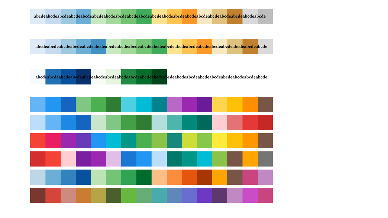
When it was decided that every tree in the visualization should have a separate color I made some research into color theory. Since the visualization has 16 trees it would also need 16 different colors. I initially looked into dividing the color circle into 16 different hues, while keeping the same saturation and value. However, this did not yield the desired result as some of the colors were to similar to be able to be used as representations of different categories. Also, some of the colors could not be displayed adjacent to each other sine they were too far apart on the color circle.
I therefore ended up using a combination of different hues, saturations and values. The final colors were selected based on the following criteria:
Some of the tested color palettes as well as the final one is available at ivismesh.github.io/individual/jonatan/color_palettes.jpg The final color palette is the one at the top, which is also shown in comparison to some black text.
Total time spent: 5+5 hours (research + testing).
When searching for a term which had a corresponding node in the second level of the tree, the node was not displayed. Time spent fixing this bug: 3 hours.
Total time spent: 3 hours.
I requested some of the project group meetings, which basically meant trying to get the whole group to agree on a meeting time. For each of the project meetings we had I booked a study room at the main library. I also booked a meeting with the teaching staff to ensure that we got feedback on the project. Before the final demo I performed a test of the visualization on the Z1 server in the VIC studio.
It is very difficult to estimate the total time spent on these tasks. Booking a study room only took a few minutes each time. I have made 7 bookings. Getting project feedback took about 15 minutes (excluding travel time). Testing the demo on the Z1 server took about 10 minutes (excluding travel time). At one time I spent about 3 days (on and off) trying to set up a project meeting.
Total time spent: 1 hour (excluding travel time).
First and foremost, I feel that I have learnt how to make a good information visualization. This includes how to choose an appropriate visual structure for a data set and how to map the data to that structure using d3. I have learnt a lot about color theory; the color circle, different color models, analogous and complementary colors, but also how to apply this in practice.
When it comes to project management I have learnt that a project group with more than five members should appoint a leader. I have also come to appreciate how important it is to write down as much as possible. Things like design descisions and work distribution should definitely be written down.